Blitz – Design System
Elli - Volkswagen Group

Creating, Driving and Managing VW Group Elli's First Design System
Elli’s rapid growth led to fragmented UI patterns, duplicated components, and inconsistent design choices across products. This lack of structure was slowing down development and compromising the user experience. To stay competitive in the fast-paced e-mobility market, we set out to standardize components, align design and engineering efforts, and streamline workflows across teams.
Glance of our token system on Figma Tokens Studio
Lead UX/UI Design Systems Designer
As I joined the project, my first step was to connect with key stakeholders to get a clear overview of the current state of the design libraries, implemented components, and, most importantly, the development workflow at Elli.
I held in-depth sessions with the Product Owners of the two teams managing the web Storybook and the mobile foundations team. I also met regularly with designers to gather feedback, test ideas, and observe how they were working with the existing design libraries.
At first glance, the goal of the design system was to bring visual and functional consistency across Elli’s cross-platform products. But to achieve this, we needed to tackle a significant amount of foundational work first.
Key Findings
Outdated and unmaintained web component library (Storybook)
No documentation or guidelines for component usage
Duplicated components in both design files and codebases
No component repositories for iOS or Android
Large, growing technical and design debt
Inconsistencies between design and implementation
Broken components and scattered styles (color, type, spacing, grid)
No global design tokens or style definitions
Multiple brands (Elli, Škoda, SEAT) needed to be supported
Define and implement a scalable design token structure
Export design assets as JSON for development
Create and maintain cross-platform, token-based UI components
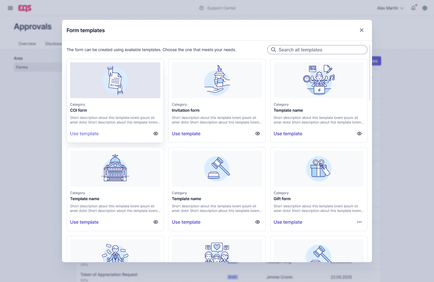
Build clear guidelines and documentation (via Supernova)
Advocate for adoption and consult on best practices across teams
Elli’s fast-paced product growth led to increasing technical and design debt. Feature development often prioritized speed over consistency, resulting in:
Repeated design decisions
Difficulty finding or reusing existing styles
Poor component reusability
Slower delivery speeds
To stay competitive in the e-mobility industry, Elli needed to ship high-quality features faster — but without a clear design system in place, this became unsustainable.
Additionally:
Elli supports 15+ product teams, but not all of them have a dedicated designer.
Mobile teams lacked a shared component library or unified visual language.
There was no single source of truth for Android and iOS developers.
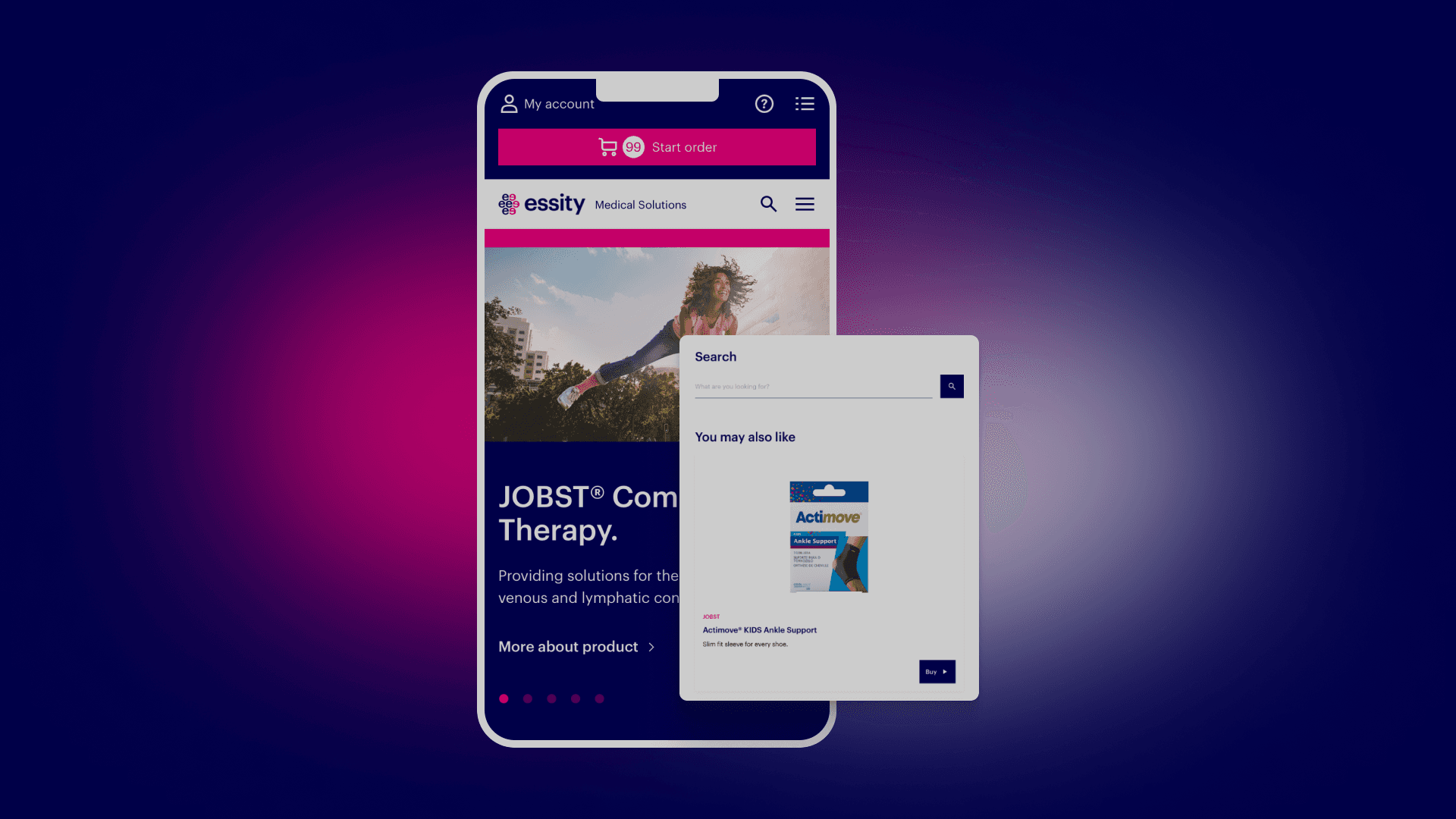
Elli’s product suite spans web and native platforms, and includes multi-brand apps like “Charge @ Home”.
Advocating for a Non-Existent Design System
Introducing design quality and consistency in already live products is never easy. It required persistent stakeholder engagement, especially with engineering leads and the VP of Product.
My approach focused on:
Demonstrating how a design system improves velocity, scalability, and quality
Showing how design tokens allow easy adaptation across brands and platforms
Highlighting the impact of fragmented components on developer efficiency and UX
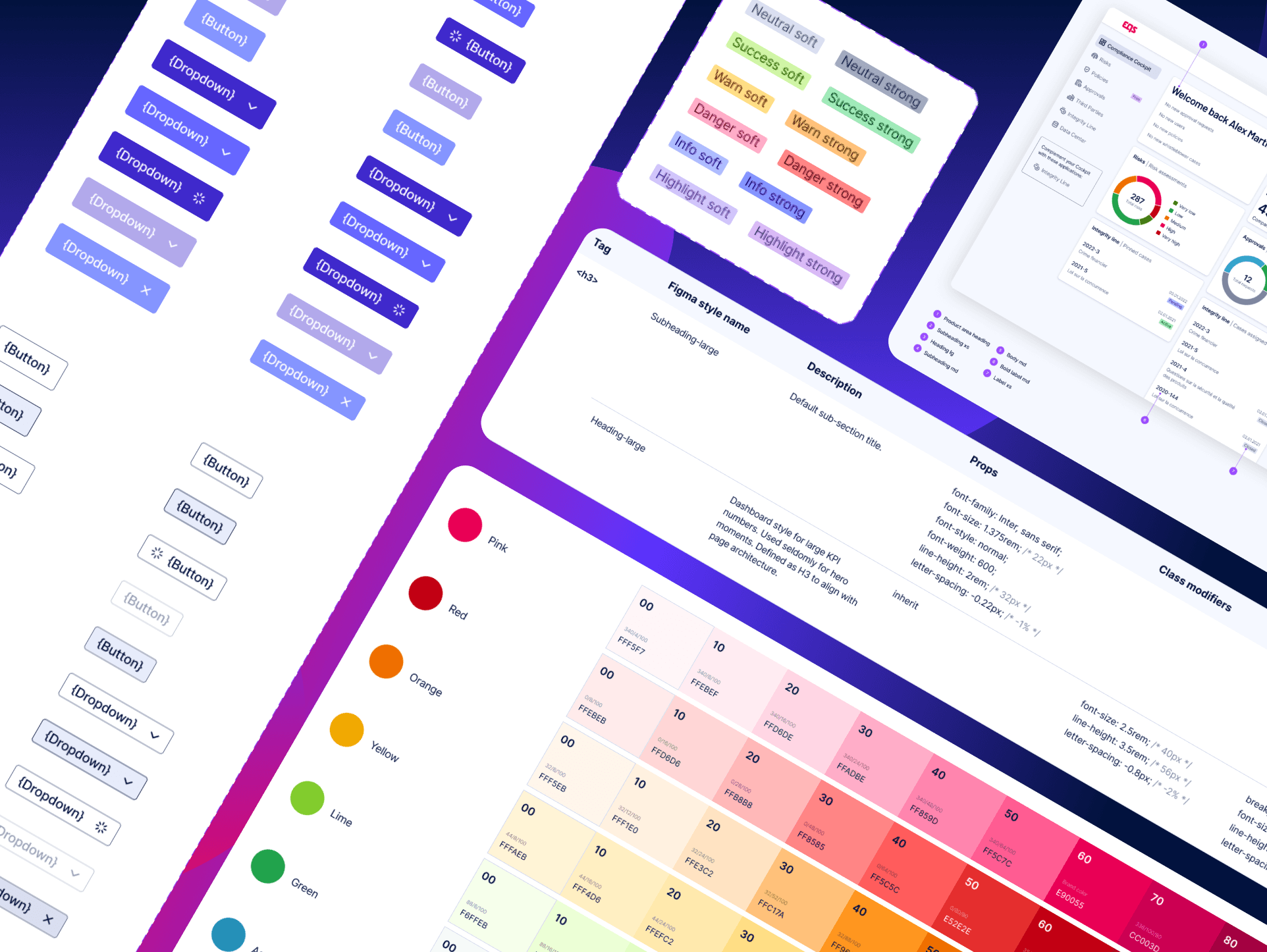
Design Tokens as the Foundation
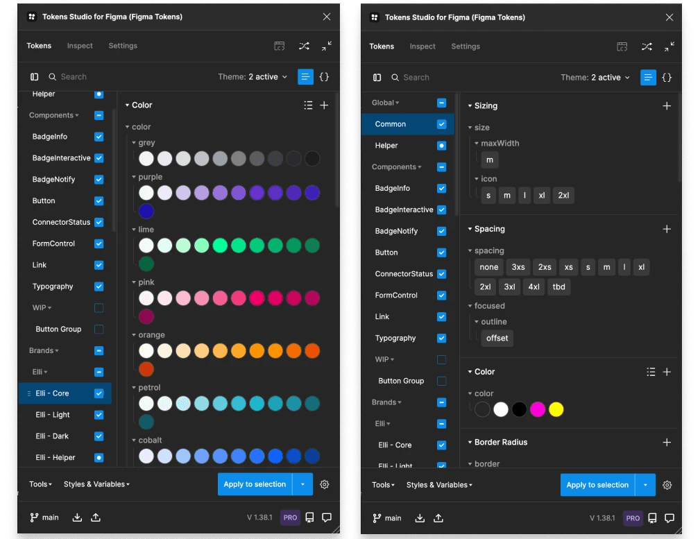
We introduced a fully tokenized design system using Tokens Studio for Figma, enabling us to define and sync:
Color palettes
Typography
Spacing & sizing
Component states
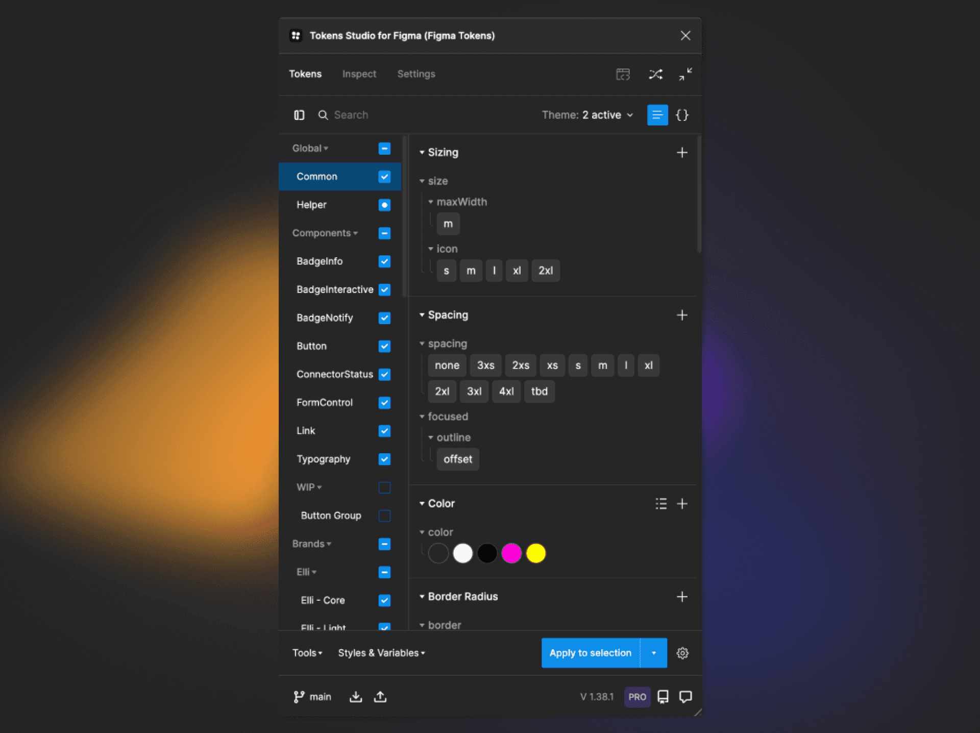
Later, Figma launched Variables, allowing us to integrate tokens natively — eliminating the need to maintain hundreds of variants.
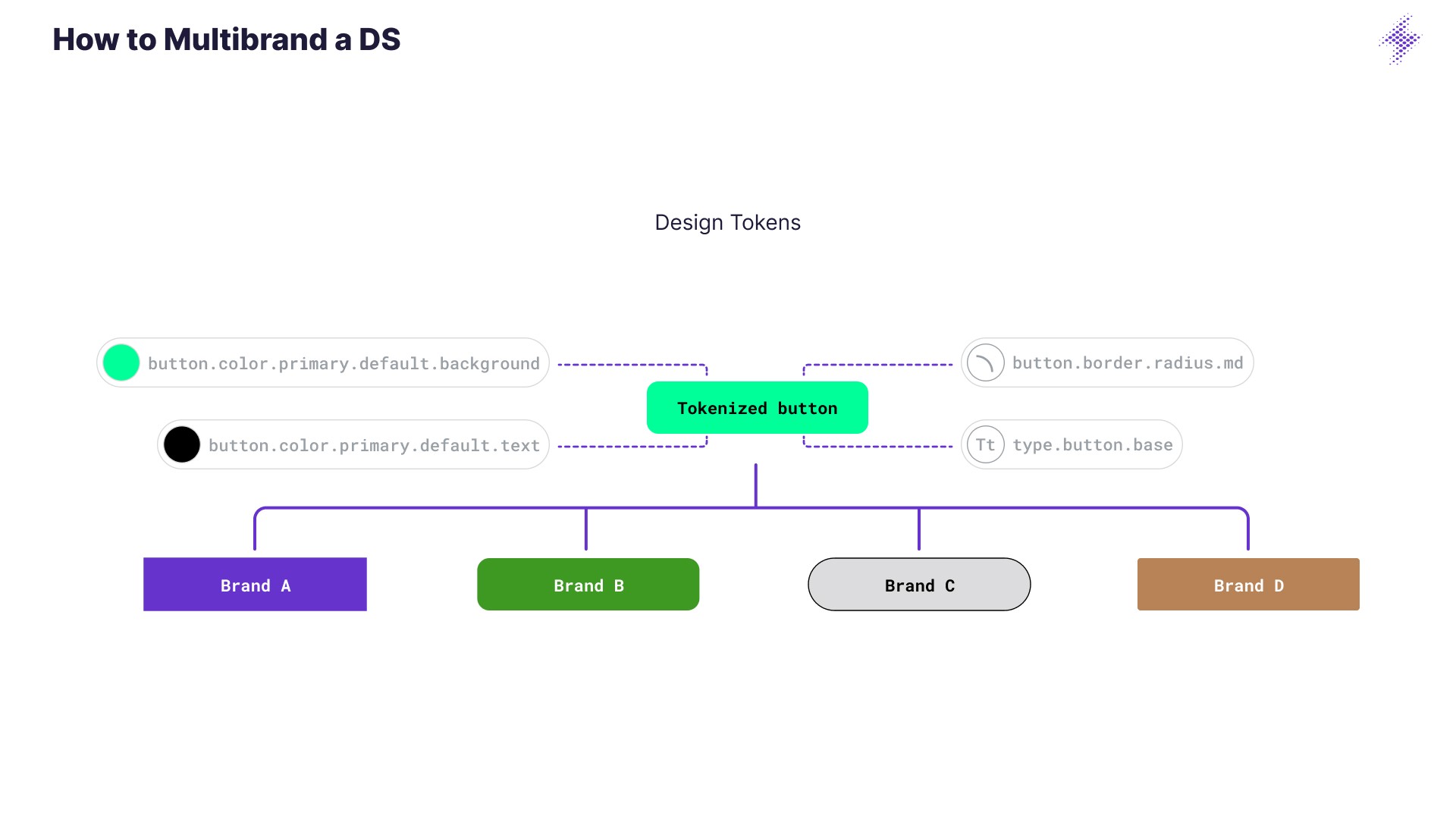
We implemented a multi-brand color system supporting Elli, Škoda, and SEAT, allowing seamless switching between brand themes for shared components. This removed the guesswork and manual overrides that previously slowed down both design and development.
Implementation Progress
So far, we have:
Implemented 10+ reusable components in Storybook, powered by Figma design tokens exported as JSON
Created a central documentation hub in Supernova, including:
- Usage guidelines
- Best practices
- Token references
Started bringing these components into iOS and Android codebases
Established a cross-functional workflow with engineers and designers for ongoing collaboration
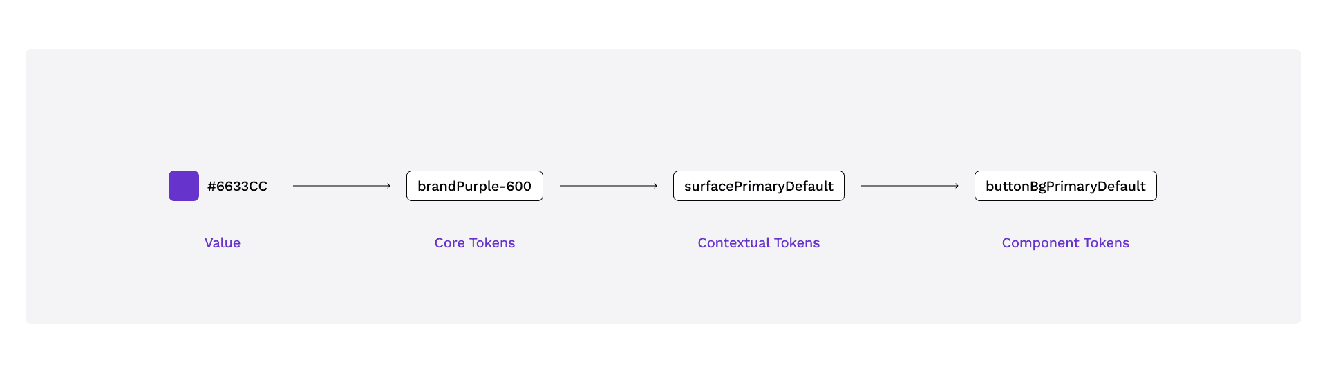
Example of how the component tokens are built

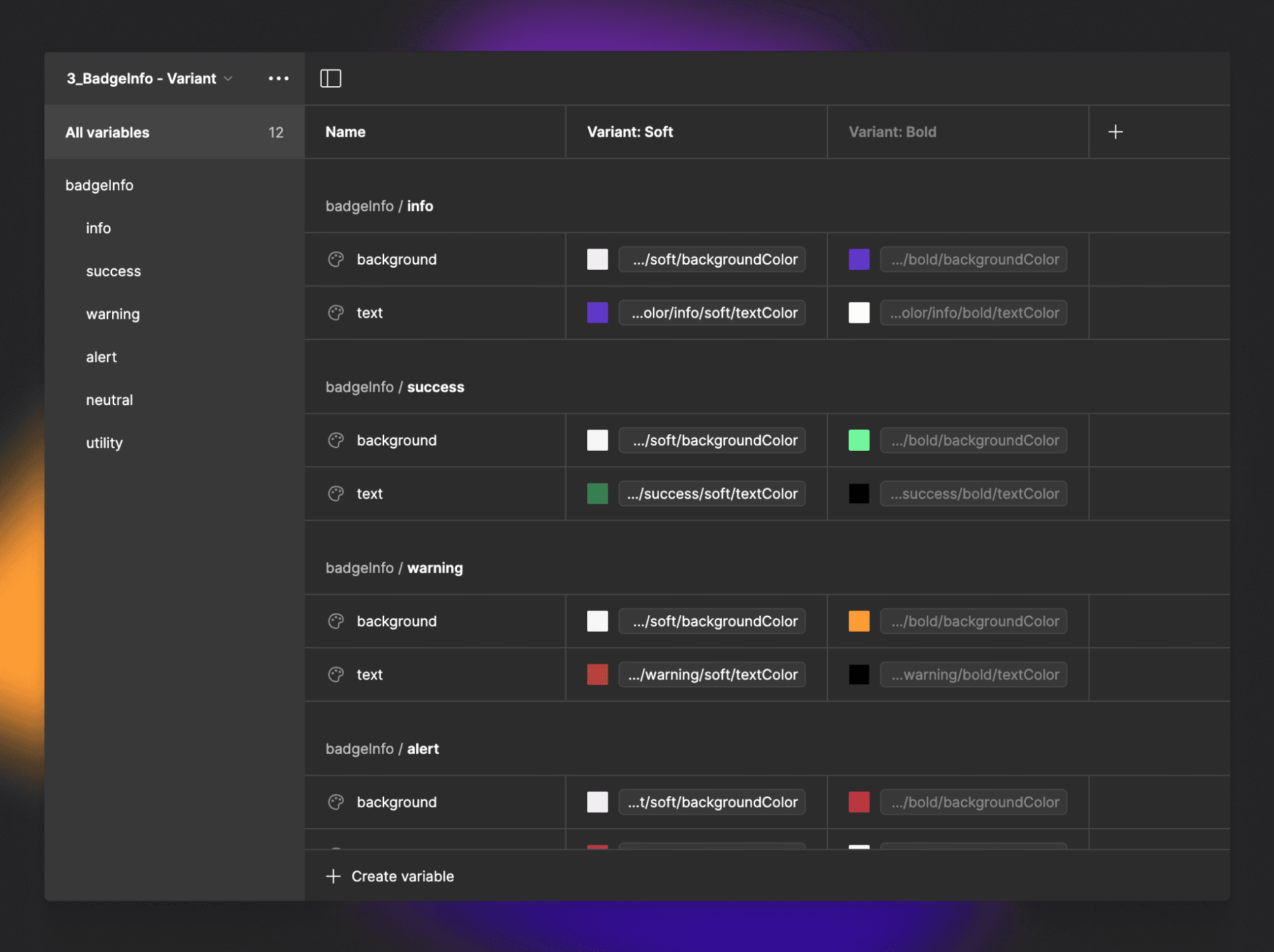
Example of brand / states / variants switching with figma variables (in a single component)
Early Results
~30%
Developer implementation time reduction for new features using DS components
60%
Decrease of duplicated components in Figma
40%
Inconsistencies cut between design and code
2.5x
Increased design-to-dev handoff satisfaction score (internal survey)
This project showed how a well-planned and well-advocated design system can transform how teams build digital products. From chaos to clarity, Blitz laid the foundation for scalable, maintainable, and high-quality design at Elli.